Amon Carter Museum Gets A Fresh New Look In Fort Worth
ArtandSeek.net September 12, 2019 64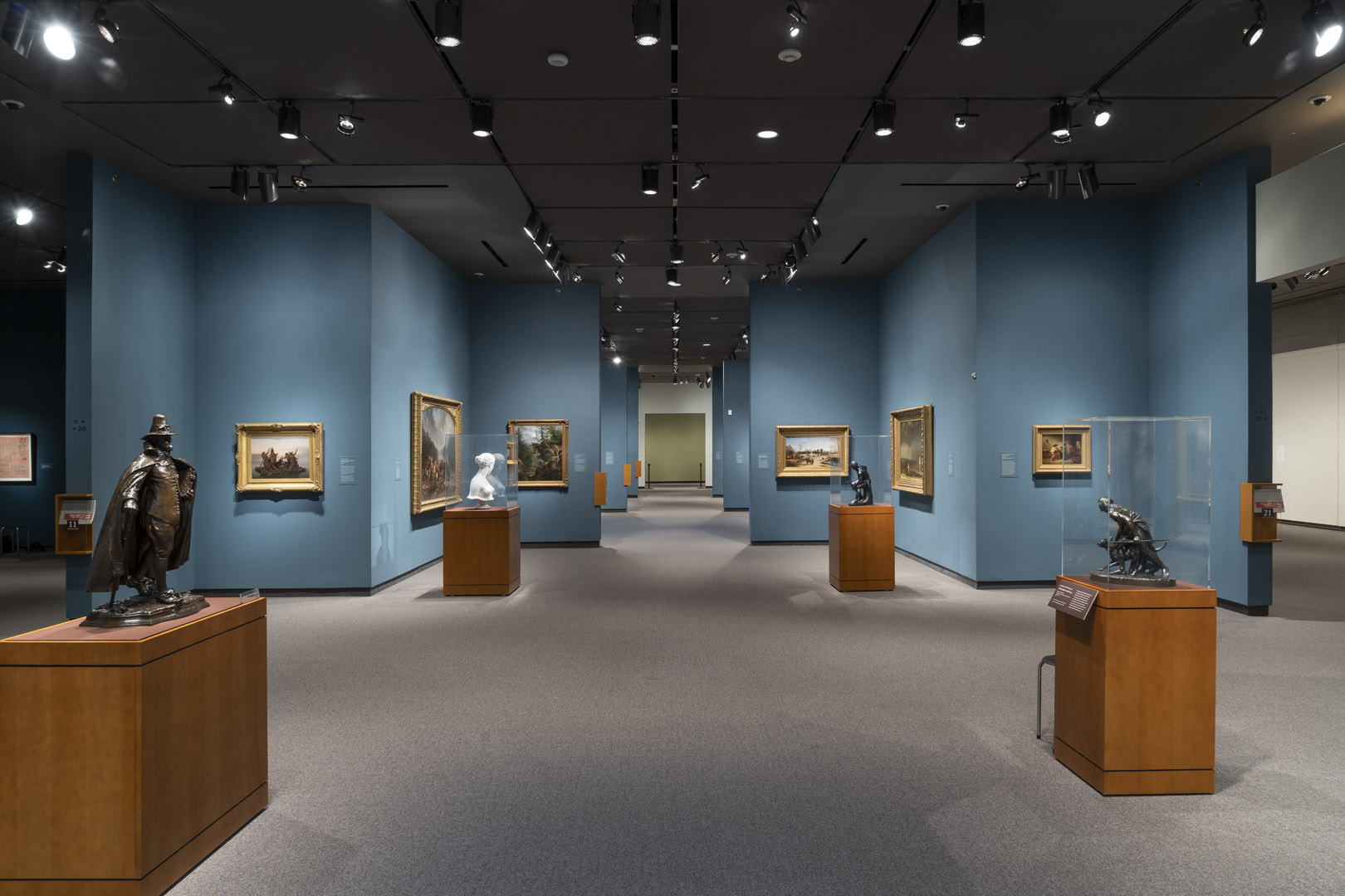
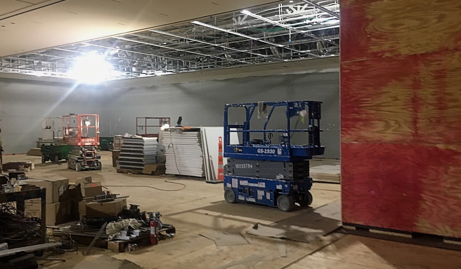
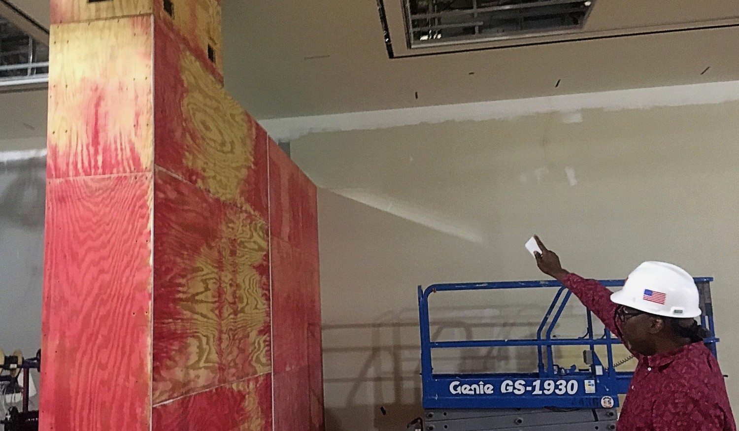
The “before” look of the Amon Carter’s second-floor galleries. All photos courtesy of the Amon Carter Museum unless otherwise noted.
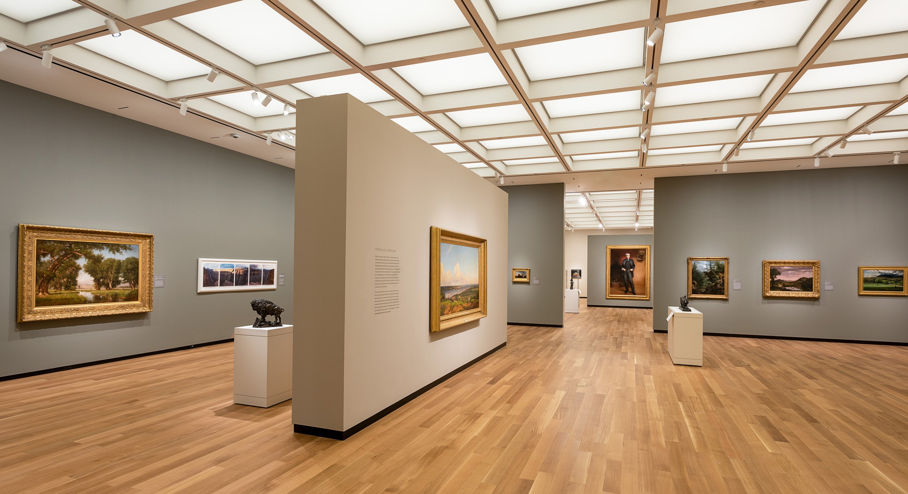
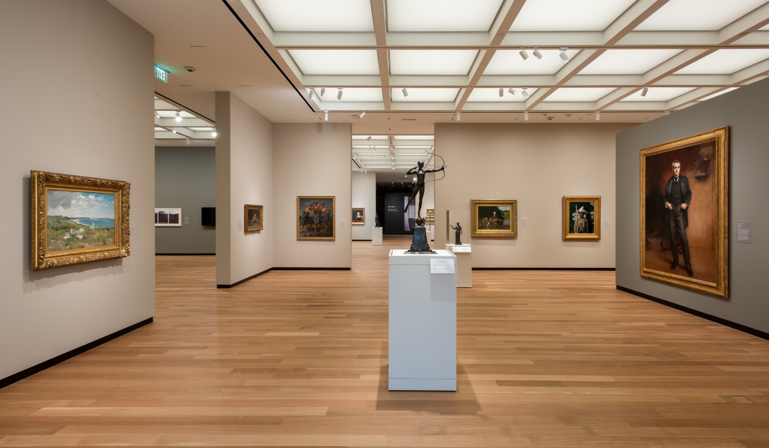
The “after” look. The coffered ceiling and the LED lighting grid are designed to suggest daylight softened by a scrim.
Tonight is the gala opening of the Amon Carter Museum of American Art. And on Saturday, the general public gets their first look at the building’s major overhaul – with a celebration, Party on the Porch. KERA’s Jerome Weeks reports, the year-long remodeling has created practically a new museum.
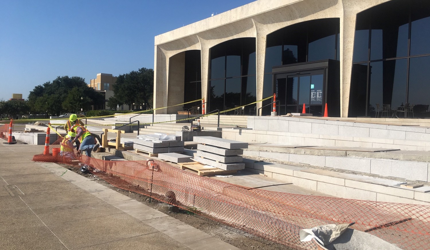
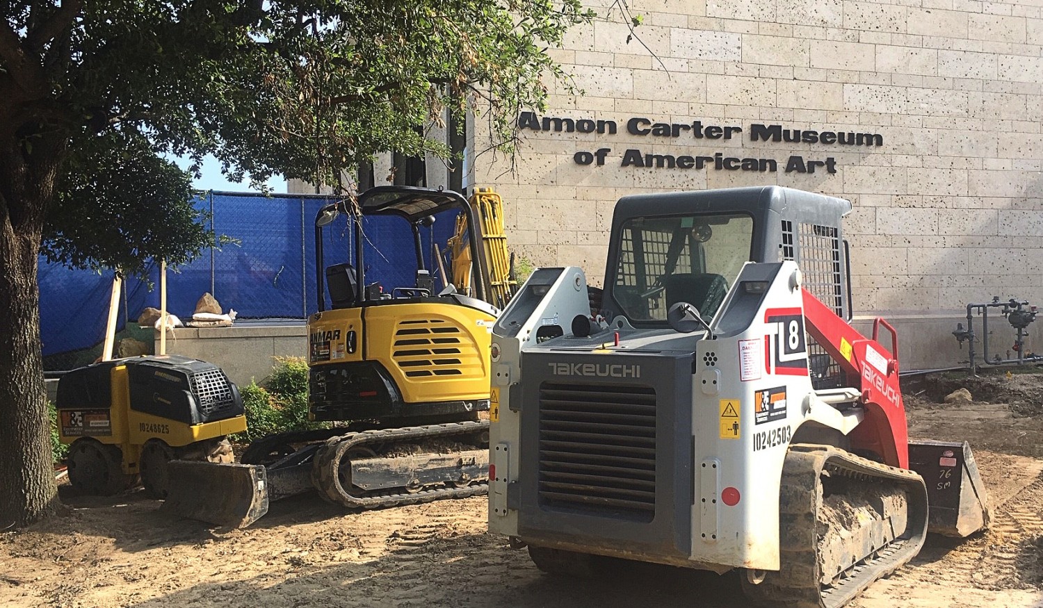
The eleven-million-dollar renovation includes high-tech lighting, a more open gallery layout, an expanded library-research center and a more accessible main entrance.
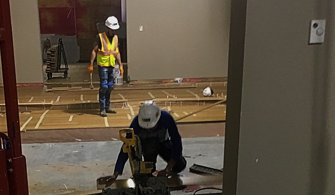
In July, Alfred Walker, the museum’s head of facilities, described the work going on – talking over the noise of hammering and beeping, automated lifts.
“It’s a different look up here now,” Walker said. “And so you can see they’re changing to put wood flooring in. So it really gives the gallery a lot of flexibility on what we want to do here.”
That’s because the second-floor galleries will have movable walls the Amon Carter can reconfigure. They’ll be changed to suit touring shows; there’s even increased floor space, so larger shows can be accommodated.
But new fixtures and new walls do not convey the scope and depth of the changes. When people think of renovations, they tend to think in terms of remodeling a house: new carpeting, a new bathroom, a fresh coat of paint. But for an art museum, changes on the scale of the Amon Carter’s involve nearly every department in the organization. The Amon Carter administration took the opportunity to re-brand the museum, re-consider its programs — from education and outreach and research, right down to the information cards on the walls and a new vault for photographs. All that led to re-shaping the way viewers encounter the entire collection.
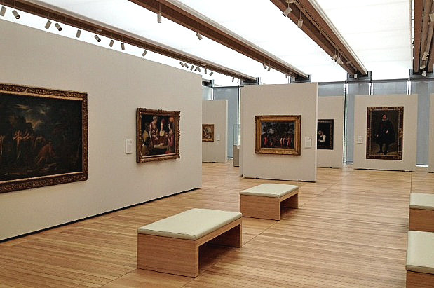
The Kimbell’s Renzo Piano Pavilion – with a familiar color scheme and flexibility. Photo: Jerome Weeks
Andrew Walker, executive director of the Carter, says that during their preparatory research on the original, 1961-era building, they learned that architect Philip Johnson had wanted a skylight for it – which would lend all of the building the kind of open-air, sunlit welcome his atrium offers. This wasn’t possible in 1961 — or even when Johnson re-did the building in 1999 — because sunlight damages artworks, particularly artworks on paper, like the Amon Carter’s famed photography collection.
So instead of openness and light, a more hushed, carpeted, intimate feel for the galleries was developed — Walker calls it “domestic.” Unfortunately over the years, domestic has come to feel dim, dowdy and predictable — particularly because the second-floor galleries, many of them housing the permanent collection, have a permanent, closed-in layout displaying some of the collection’s most conventional-looking artworks. Worse, when a touring exhibition demanded scale and scope – like the 2016 exhibition devoted to Thomas Hart Benton’s relationship with Hollywood – the Carter’s confining spaces didn’t provide the viewers the chance to step back and really appreciate the oversized works. Nor did they let curators space out the displays. A show could feel wedged into the museum’s upper gallery.
So the realization by the renovation planners that overhead panels of LEDS could imitate the look of a skylight — without the sun’s damaging effects — that realization came like . . . turning on a light bulb. The museum could be transformed.
“This technology-driven ceiling,” Walker says, “which brings this beautiful, even lighting into the galleries, was really an inspiration to innovate. So it’s an intentional redeployment of the collection that allows the building and the art to have synergy.”
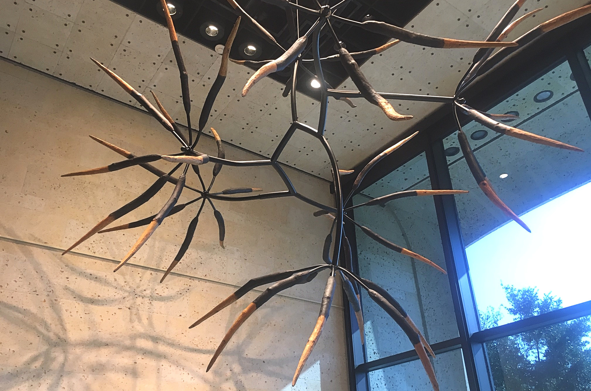
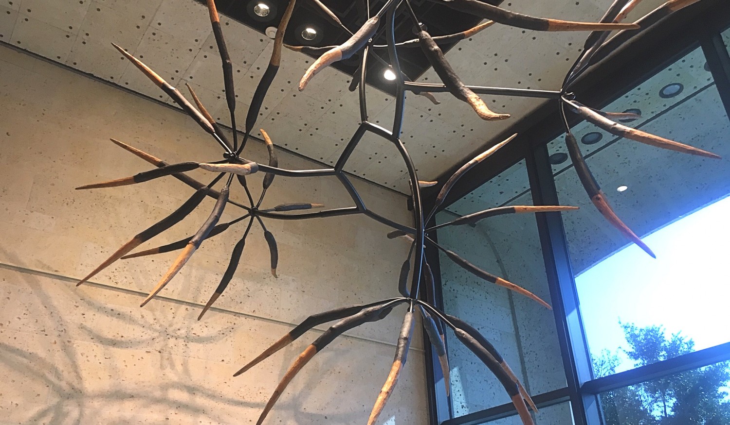
The James Surls sculpture, ‘Seven and Seven Flower’ – dedicated to his daughters – on loan in the main entrance lobby. Photo: Jerome Weeks
Perhaps by coincidence or design, the galleries’ handsome new clarity and their new color scheme recall those of the Kimbell’s nearby Renzo Piano Pavilion: crisp wooden floors, cream and grey walls and a softly glowing ceiling. What’s good for the golden goose is good for the gander across the street: That set-up caused the Kimbell’s masterworks to gain fresh life, popping out of their chiaroscuro and their darkened gilt frames. It does the same for the Carter’s familiar favorites. Rarely have the Carter’s treasured bronze broncos looked so handsome and energized.
By doing so, the gallery design is basically playing catch-up with the collection. The Carter certainly began as a “Museum of Western Art” to house newspaper publisher Amon Carter’s collection of notable works by Charles M. Russell and Frederick Remington. And the museum has acquired tremendous works of classic Americana: 19th century-early 20th century realism by the likes of Winslow Homer, Thomas Eakins, Augustus Saint-Gaudens and Albert Bierstadt. But long ago, it overflowed its original, historical and conceptual confines – not just via photography by the likes of Man Ray, Eliot Porter and Richard Avedon but also through stylistically looser, more experimental, 20th-century works by Georgia O’Keefe, Stuart Davis, Louise Nevelson and Ben Shahn. This widening purpose was reflected in the building’s burgeoning physical growth (some 50,000 square feet were added with Johnson’s 1999 re-do). It also led to a new name, signaling this new encompassing embrace. In 2010, the Carter was re-christened The Amon Carter Museum of American Art.
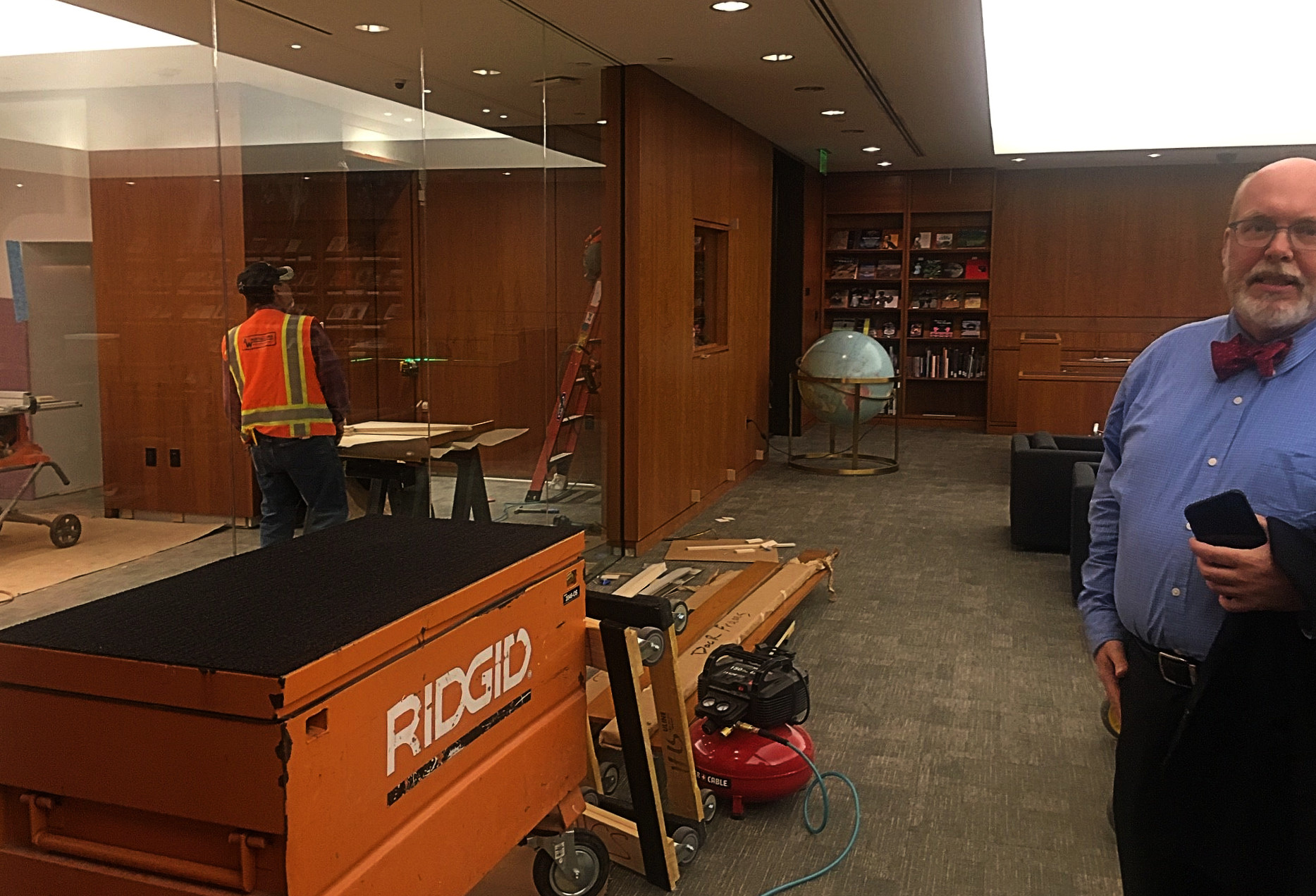
Executive director Andrew Walker visiting the still “in process” research library expansion. The library is directly off the central atrium, and the renovation opened up that new space on the left. Photo: Jerome Weeks
The fact is, the Carter’s ambitions were on a collision course with its collection since the beginning: Hiring Philip Johnson to build a home for ‘cowboys and Indians’ art may have led to one of Johnson’s more restrained and classically inclined efforts. His clean-lined modernism — making Texas limestone and darkened bronze do the work of Greek columns — may have a lightness and sharpness that etches like the Texas sun. It even echoes the color palette of many a Remington and Russell. But it often felt at odds with what was inside. Walking up that serene atrium into the galleries of buffalo sculptures and wilderness landscapes did not bring them forward into contemporary relevance. More often, it seemed to announce their distance from their surroundings. One didn’t feel connected to Fort Worth’s history so much as aware of how ambitiously new and aggressively commercial and contemporary everything else around these artworks had become. Poke your head outside and take a look down Seventh Street.
Besides, Johnson’s inclination in his architecture was typically to ‘win,’ to sell his genius, to dominate a skyline, to seduce a viewer. The heck with whatever the building was supposed to do. At the Carter, it took rich, powerful, period works — like Thomas Moran’s “Cliffs of Green River” or Bierstadt’s “Sunrise, Yosemite Valley” — to overcome Johnson’s crisp, modernist symmetries or the galleries’ own hushed, dim ambience. Or consider an audience favorite: Typically, on a first visit, John Singer Sargent’s portrait of “Alice Vanderbilt Shepard” is a glowing charmer and a heartbreaker – particularly when one knows the beautiful young lady is holding that military posture because she fractured her thoracic spine falling out of a tree and, as punishment, her father refused medical treatment. She’s in pain, holding that position as a model for Sargent but bravely disguising it. But in the Carter’s muted setting, the portrait ultimately felt left in shadow. Not anymore. The tawny background, Alice’s pale pink skin, Sargent’s masterful handling of the tumble of greys and whites and silvers in her blouse front and coat collar: They all seem like they were dashed off last week.
The “cowboys and Indians” image of the Carter that persisted in the public mind – ‘real art for real people’ — no longer reflected its goals; it even came to hobble it. It was something the Carter often had to overcome to get people in the door: We’re not just all that familiar stuff you’ve seen already. The Kimbell gets the Big-Rich, Big-Name Masterpieces, the high-class, canonical favorites. The Modern Art Museum dazzles with its hip surprises: Ta-dah! You never thought art could do this, did ya? Yet the Carter isn’t really trapped between its neighbors. It actually inhabits something of a sweet spot when it comes to the public and to opportunities for serious re-appraisal and re-education. It has free admission, for starters. But it’s also able to draw on everything from old-fashioned realism to American Impressionism, early modernism to fashion photography, documentaries to posters, indigenous artists to immigrants – and Americans importing the European avant-garde, generation after generation, all of this up to World War II. Unlike the Kimbell or the Modern, the Carter has the story of all of American art to tell — up to the point when American culture became world culture.
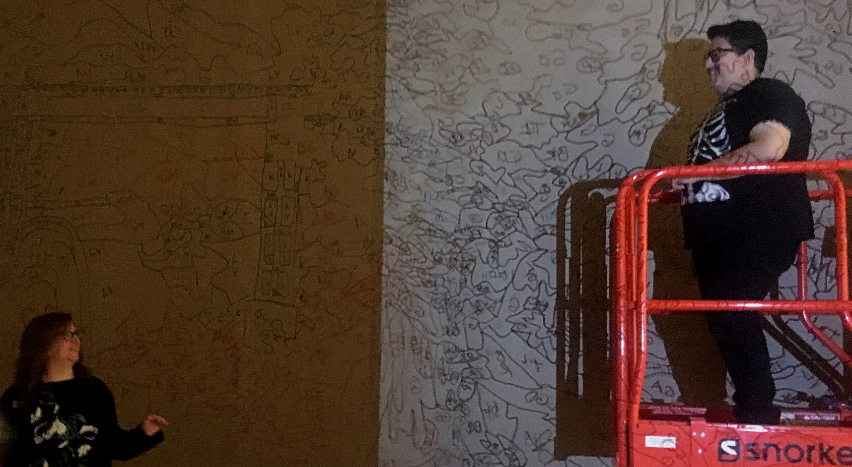
Amon Carter curator Maggie Adler and artist Justin Favela, working on his immersive, hallway-long work, “Puente Nuevo.” Photo: Jerome Weeks
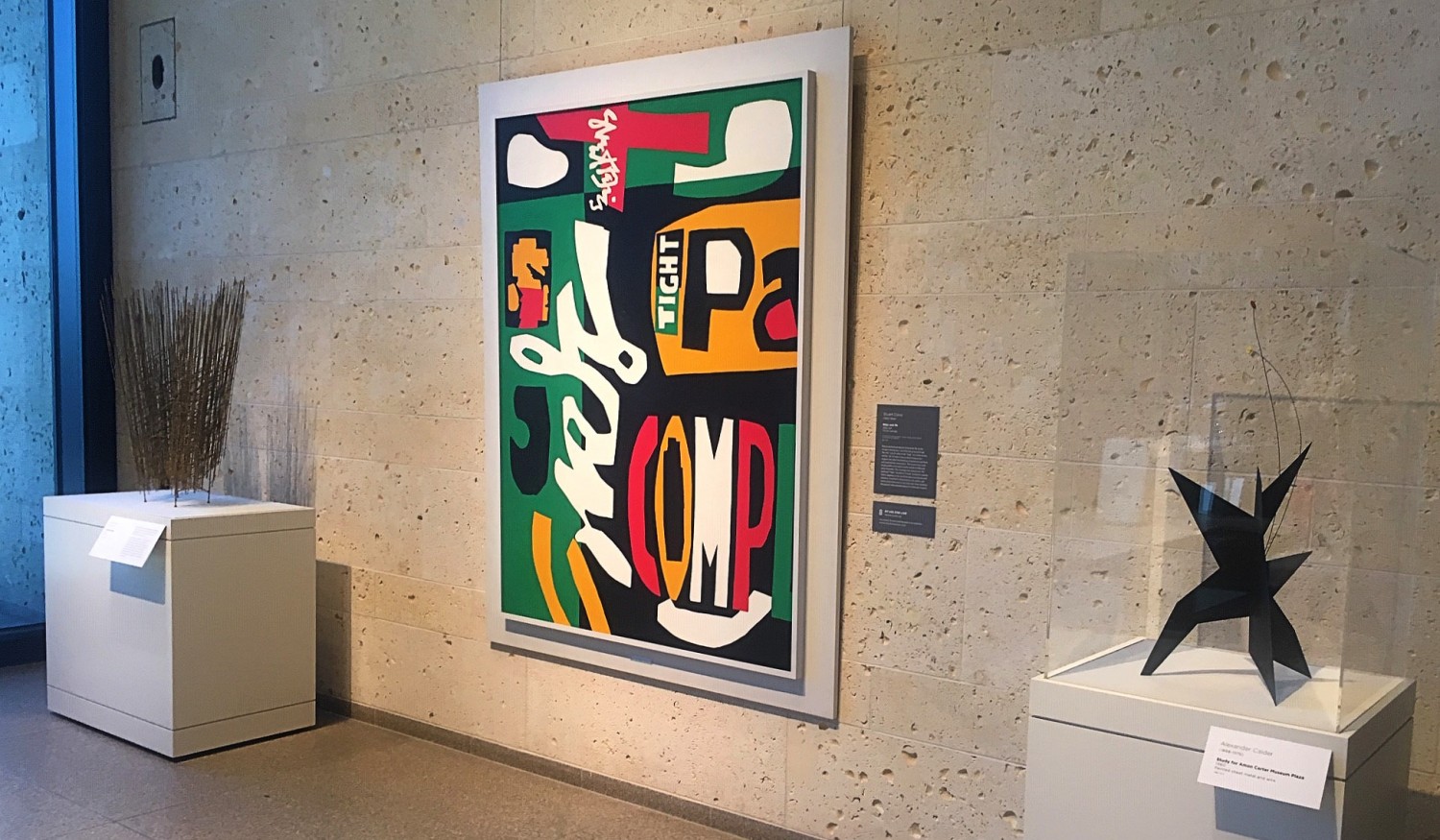
So that’s what Walker means when he says Johnson’s building and the collection can now achieve “synergy.” Reconfigured the way the collection has been, they more or less amplify each other; they chime. Modern masterworks are now outfront and in the limelight, setting the tone. To be sure, the Carter still has substantial “legacy” galleries upstairs devoted to the western art of Charles Russell and Frederic Remington. But near the main entrance, visitors first encounter works by Alexander Calder, Louise Nevelson, Stuart Davis and Georgia O’Keefe. All of this makes the re-invented Carter feel stylishly “mid-century modern.”
The museum is underscoring such changes by marking its re-opening with a major exhibition devoted to the early, formative work of the great Gordon Parks in fashion photography and photojournalism (“The New Tide, Early Work 1040-1950”), two new installations : an interactive digital one by Camille Utterback and an entire “immersive” hallway, called “Puente Nuevo” (“new bridge”), which has been turned into what amounts to a giant, pinata version of Mexican landscapes by Justin Favela.
But also opening this week is the new Works on Paper gallery on the mezzanine. It showcases 23 paintings by the Fort Worth brothers Scott and Stuart Gentling. The exhibition is called “Seeing in Detail,” and rarely has a title been more apt. The Gentlings’ watercolor portraits of native Texas birds have an astonishing level of observation and execution.
It’s typical of the Carter that, even now, one foot remains in a very American tradition of classic bird portraiture and landscape painting.

