Review: ‘The Man In The Glass House’ – The New Bio of Powerhouse Architect Philip Johnson
ArtandSeek.net November 2, 2018 19Five years ago, I heard Mark Lamster was working on a new biography of architect Philip Johnson. In that case – I joked when we met – moving to Dallas wasn’t the best idea.
At the time, Lamster had recently been appointed both associate professor at UT-Arlington and the new architecture critic for ‘The Dallas Morning News.‘ The move to North Texas wasn’t the best idea because, as I noted, over the years, Johnson had gifted us with some of his decidedly lesser works, such as the nobly-intended-but-persistently-lugubrious JFK Memorial and the nobly-intended-but-clumsily-wedged-in Thanks-Giving Square and the nobly-intended-but-physically-dangerous Fort Worth Water Gardens. And then there’s the Crescent, which like many late-Johnson projects, manages to be lumbering and frivolous at the same time, Frankenstein’s monster decked out in French lace.
 What’s more, judging from Johnson’s media profiles over the years – plus what I’d thought was a mostly youthful fling with fascism – I took the man to be more than a bit vain and cynical. As Johnson himself defiantly quipped to a 1983 gathering of architects, “I don’t have any principles, in case you hadn’t noticed.”
For his part, Lamster responded to my joke by saying he wasn’t writing a biography of Johnson because he thought all his buildings are great. Or that he actually liked the man. “I think what makes him interesting is that he was deeply flawed,” he said. And Johnson deserves a new bio because he was arguably the major force in modern American architecture.
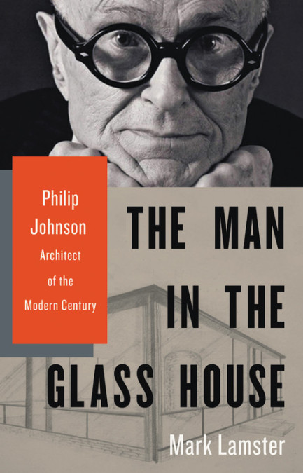
True. And that attitude – clear-eyed, knowledgeable, on target – is what Lamster brings to his exceptional ‘The Man in the Glass House: Philip Johnson, Architect of the Modern Century.’ He’s also peppered his book with droll, deadpan observations. When World War II began and a desperate England was gearing up its defenses against Germany, the visiting Johnson reported he didn’t much care “for the baggy volunteer uniforms.”
‘The Man in the Glass House’ is compelling reading partly because Johnson, who died in 2005, was such an outsized influence, such a conflicted character – and because capturing him between book covers is like hammering mercury. It’s a task Lamster pursues with deftness and determination. He will not let the man or his achievements and blunders get away with easy deflections. Towards the end of the 528-page book, this Javert-like pursuit starts feeling long, but then, Johnson lived – and stayed active and influential – well into his nineties.
This is the first time, for example, I’ve encountered such a thorough account of Johnson’s totalitarianism. Not just his anti-Semitism or the ‘Grey Shirt’ stormtrooper uniforms he designed for his homegrown, proto-fascist party – all that, we knew. But Lamster even looks into whether Johnson, during several visits to Germany in the 1930s, was a Nazi informant – something William L. Shirer proposed in 1940 in his best-selling, ‘Berlin Diary.’ Or whether Johnson used Nazi funds for his political efforts back in America – a federal crime.

The Glass House, 1948-49. Photo: Thomas Nesekeri/Flickr
“There is no evidence, however, that he violated American law,” the biographer concludes – partly because Johnson was wealthy enough to underwrite his own vanity projects (he barely even noticed the stock market crash that triggered the Depression). For him, fascism was more about ‘Triumph of the Will’-style theater and Nietzschean elitism than it was substantive politics, economics or military aggression – about which he knew very little. He found the German army’s burning of Warsaw to be “a stirring spectacle.” Whatever his motives or the source of his funding, by 1940, Johnson was the subject of five, separate, FBI case files. Not exactly a resume to win over future clients.
Lamster’s title gives an indication of the brilliance, the contradictions and the self-serving manipulations he uncovers in this would-be übermensch. ‘The Man in the Glass House’ refers, of course, to what is still one of Johnson’s most famous and beguiling achievements, the Glass House (1948-49), his own, transparent home that seems to hover on a Connecticut overlook.
But the title also echoes ‘The Man in the Glass Booth,’ the novel-turned-play-turned-film by Robert Shaw. That story follows a rich industrialist who’s apparently a former concentration camp commandant, now hiding out in a plush Manhattan penthouse. But – much like Adolph Eichmann, the inspiration for Shaw’s tale – he’s kidnapped by Israeli agents and put on display in a public trial in Jerusalem. Even here, though – locked inside a bulletproof glass box – the mystery of his real identity persists.

‘Le Croissant Tres Grande’ – The Crescent, designed by Johnson/Burgee Architects, 1986. Photo: Jerome Weeks
Johnson, Lamster writes, had similar issues with ‘apparent transparency’: He’d admit to indiscretions or influences in order to hide other indiscretions or influences. He denied (or downplayed) credit for other contributors on a project – to an extent that was extreme even in an architecture firm. He promoted historic preservation and the ideals of what we now call ‘the new urbanism’ – while he simply ignored such principles when his own projects called for bulldozing entire city blocks.
In short, Johnson’s is a deeply American story: He kept re-inventing himself. Fortunately for him, he had the means and the connections to shed his skin and make his new identities matter.
And yes, amid all this, Johnson helped produce masterworks. The Seagram Building in New York (1958), for one, is perhaps the single most influential skyscraper in the country, a testament for contemporary materials being used for contemporary ends, a way to make 38 stories of bronze, steel and glass soar. And, naturally, there’s the Glass House. Upon first sight, it can feel like a breath of crystalline, beautiful truth, four glass walls and little else, modernism in one of its purest forms.
As even Johnson admitted, his house and the Seagram owe a great debt to Mies van der Rohe’s “International” style. Van der Rohe was the lead architect on the Seagram, but Johnson was heavily involved in making that choice – as well as eagerly courting, promoting and advising Mies. As Lamster makes clear, this would become one of Johnson’s most important roles: He would be the conduit for modernist architecture to enter the mainstream. Along the way, he transformed an avant-garde, European aesthetic into the quintessential, upscale, corporate style of the American Century: sleek, structural, simple-looking and bold.
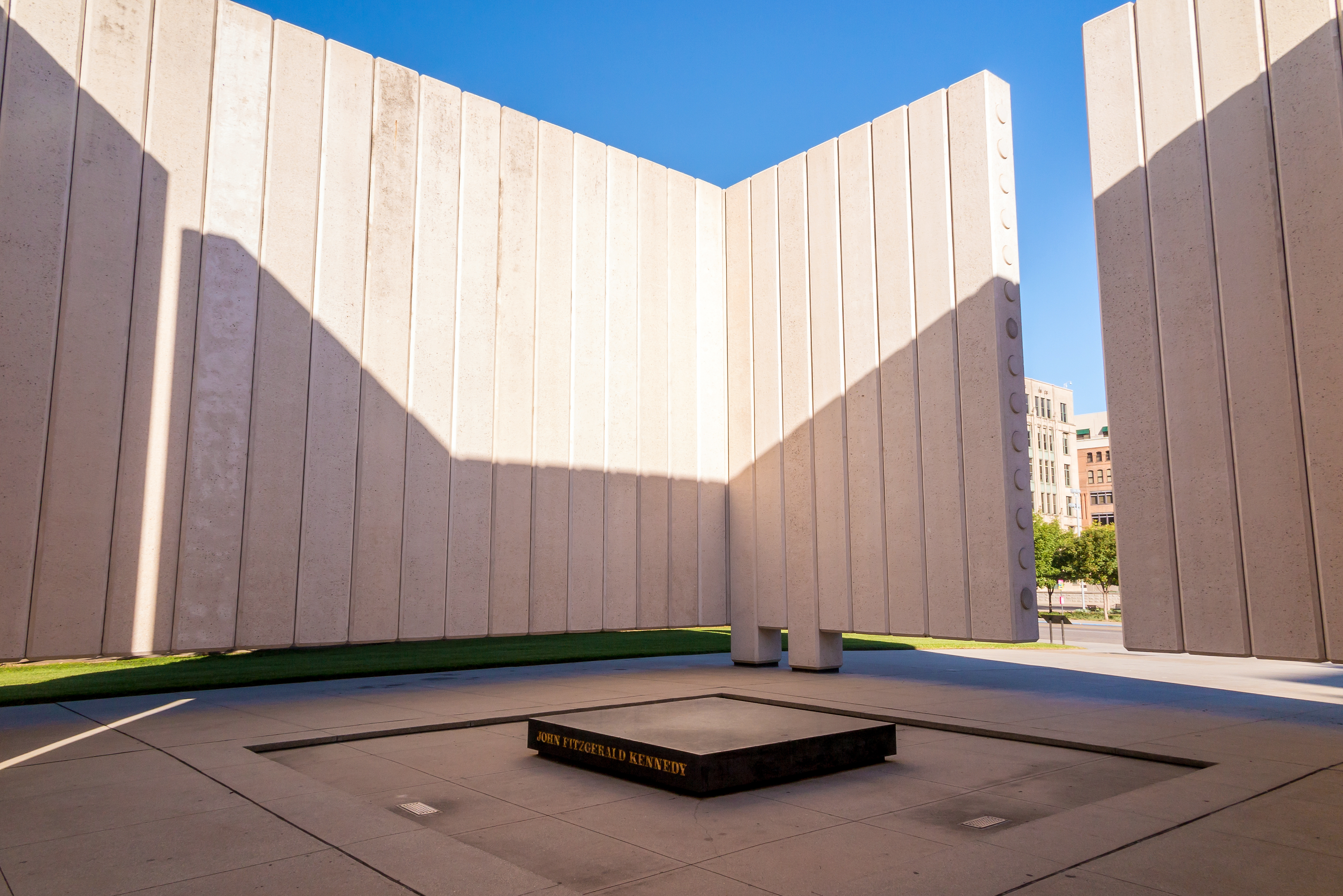
Sad but not in the right way: The JFK Memorial, Philip Johnson, 1970. As the informative plaques note, Johnson wanted to revive the ancient Greek ‘cenotaph’ – or ’empty tomb’ – as an evocation of all that was lost. It didn’t work. Photo: Shutterstock.com
In ‘From Bauhas to Our House,’ Tom Wolfe famously derided the utopianism of many modernist architects, including Johnson. Their highbrow disdain for old-fashioned, decorative flourishes on buildings was an aesthete’s idea of the revolt of the proletariat. It was, Wolfe argued, a push for the plain and functional as a symbolic chopping-off of crowned heads. Unsubtle as usual when it comes to distinguishing politics and art, Wolfe failed to recognize that Johnson loathed the Bauhaus school of design as well as socialist architects like Walter Gropius and Le Corbusier – with their mass-produced architecture and their workers’ housing. (Johnson “frankly had no interest in the average American family,” Lamster notes drily). His modernism was not radical or utilitarian; it was intended to be chic and sophisticated. And it certainly didn’t bother about ‘fitting into’ the surrounding cityscape. He built buildings that were meant to stand out. A Johnson building is typically designed to be monumental, to grab attention, to beat all the competition in the vicinity – as if a skyline or even a city block was a competition and he’d won.
Ironically, and all too quickly, Johnson’s high-society style was cheaply copied everywhere for almost anything: hospitals, bank offices, college administrations, apartment towers, discount department stores. It is still very much the maddeningly cookie-cutterish, bottom-line-minded urban world we live in today: glass curtains on tall steel frames everywhere.
In a ‘Paris Review’ interview in 1981, Texas author Donald Barthelme objected to a central tenet of almost all modernist architecture. The son of the architect who designed the Hall of State at Fair Park, Barthelme was a sly, literary post-modernist avant la lettre. His beef against modernism was its contention that if people could just live and work in beautifully-designed buildings, we’d all lead beautifully-designed lives. Culture and architecture certainly influence us, and sensibly laid-out cities can make our lives more congenial and efficient. But you don’t become a better person, you don’t find meaning in your life because you sleep in a Frank Lloyd Wright house. That conflates morality with cultivated taste and consumerism, which, by now, is practically a basic principle of much of American life.
It was the very air that the style-obsessed Johnson breathed. Yet his life and work bear witness to Barthelme’s point about polished art not really reflecting or redeeming our messy lives. As meticulous and demanding as he was with designs, Johnson couldn’t run an office. (Once in charge, he didn’t like sharing the spotlight; Lamster calls the Seagram design team “essentially dysfunctional.”) In general, he didn’t think rules applied to him. He enjoyed upending things, blowing up accepted practices. It was the source of his incredible energy and inventiveness; it also made him seem like the entitled, sheltered but slighted child he was, fighting to gain attention and resentful when he didn’t get it. His lawyer-investor father disapproved of Johnson’s homosexuality.
In this light, it’s odd that Lamster doesn’t report what Johnson thought of Ayn Rand’s novel, ‘The Fountainhead’ – if he ever read it or saw the laughable, Gary Cooper film adaptation from 1949. Perhaps he never read it or saw the film, perhaps he never put his responses in writing. On the one hand, Johnson would have hated its clunky and overblown style. And its hero, the uncompromising architect Howard Roark, was inspired by one of Johnson’s bête noires, Frank Lloyd Wright. On the other hand, the architect as a solitary, world-creating genius who deserved to brush aside the ‘principles’ of lesser mortals chimes well with Johnson’s own Randian aims: “Submission to an artistic dictator,” he wrote about the right way to run a design team, “is better than an anarchy of selfish personal opinion.”

Pennzoil Place in Houston, 1976 Photo: Pennzoil Place
It should come as no surprise, then, that Johnson morphed into a corporate opportunist and aesthetic magpie. By the ’70s, he found a favorite, big-money haven in Texas, especially Houston and Dallas. And by then, like many other designers, he’d been trying to bust out of the Miesian ‘glass box.’ He produced a remarkable variation on it by splitting one in half and re-joining it for Houston’s twinned-tower Pennzoil Place (1976). But it was a signal: The possible variations on that theme were running out. He soon turned to rummaging through history for whatever decorative little jewels he could daub onto the same, old office buildings and impress his business clients with their fancy new headquarters. It was his substitute for real opulence. He surfaced towers with stone (a costly endeavor) or gave them elaborate entrances, barrel vaults, sconces and Lego-block, ziggurat rooflines (Houston’s Republic Bank Center – now the Bank of America Center).
Once upon a more dogmatic time, Johnson called the streamlined detailing of the Chrysler Building just so much kitsch. Now, tarted-up, historic embellishment was what he sold. Even as post-modernism was becoming what Lamster calls the single most reviled architectural style of the 20th century, Johnson completed his apotheosis. His famous Chippendale-roofed AT&T building put him on the cover of ‘Time’ in 1979. That same year, he was the first winner of the Pritzker Prize. He’d become “the most prominent skyscraper architect in the world.”
Still, taking the long view, Johnson’s professional makeovers are eyebrow-raising. How did a rich kid from Cleveland, a sharp but thoroughly unfocused Harvard student, a wannabe powerbroker eager to advise Huey Long or better yet, bankroll his own ruthless, right-wing candidacy, a dashing gay man who enjoyed both Nazi rallies and Weimar Berlin cabarets, an exacting designer who earned his architect’s license in Connecticut because the requirements were easier than New York’s – how did this character become a towering advocate for architecture, a friend of Jackie Onassis, the poster child for post-modern ‘starchitecture’ and the mentor for such next-generation talents as Frank Gehry, Michael Graves, Richard Meier and Zaha Hadid?
As Lamster shows, his crucial step was becoming – of all things – a museum curator. In the early ’30s, Johnson was ostensibly still in college, but he was already zipping through different political, intellectual and architectural wardrobes, donning and doffing whatever he found appealing. He became part of an arts-centric Harvard circle that included Lincoln Kirsten (later, the co-founder of New York City Ballet) and Alfred Barr, who would become the first director of the fledgling but Rockefeller-backed Museum of Modern Art. At MoMA, the post of curator – part academic researcher, part interior decorator – played to Johnson’s strengths and deepest desires. He had money and didn’t hesitate to use it to gain influence, he loved to decide who was in and who was out – to be the tastemaker, the gatekeeper, the Pope. He also liked to be modern, to be ahead of everyone else, but with flair, not intellectual rigor.
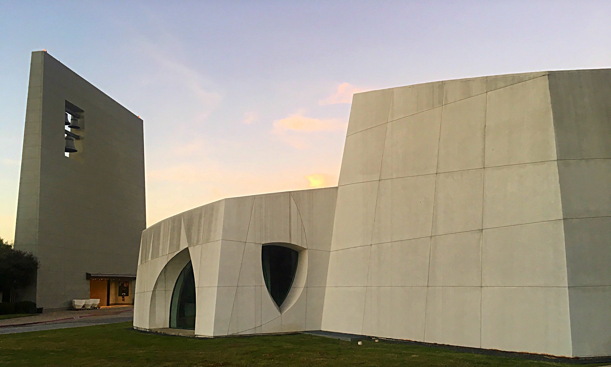
The Cathedral of Hope, Dallas, designed by Philip Johnson. Photo: Jerome Weeks
And he loved putting on a show. He wanted to grab people’s attention any way he could and shape what they thought. All this made for a genius curator. Johnson put together several of what Lamster calls the most influential shows of the 20th century, including “Machine Art” (1934) and the first survey of Mies’ work (1947). ‘The New York Times’ declared Johnson an “exhibition maestro” – for what was only his third professional effort.
The young Johnson was driven by a desire for architecture and product design to be showcased in a serious art museum and not treated, as they had been, like vacuum-cleaner manufacturing in an industry expo. Most importantly, perhaps, he also intuited that a museum exhibition should be more than just a display of artworks for public appreciation. It should hammer home an argument – “to take what was academic and make it polemic,” as Lamster writes. Meaning, an art show could be a classy form of marketing or propaganda. It could help Johnson promote the architects he approved of, the ones who could help promote him. Along the way, he could also win some commissions. His pocket-sized Rockefeller Sculpture Garden for MoMA (1953) remains a tiny but miraculous Manhattan oasis, a peaceful wedding of ponds, art works, trees and Vermont marble.
Johnson eventually leveraged all these conflicts of interest and insider dealings – plus his own talents and ambitions – into a late-blooming career as an architect. Ultimately, Lamster argues, Johnson was something of a hollow man, and by the end of this unvarnished look, it’s impossible not to agree. Within the first 30 pages of Lamster’s book, Johnson tells his mother “I have no convictions, concepts, beliefs at all. It is necessary for me to be at this stage a thorough eclectic.” A decade later, when Frank Lloyd Wright dismissed him as “a self-advertising amateur and high-powered salesman.”
But there is something to be said for the salesman, the P.T. Barnum showman – or the evangelist, the impresario, as Lamster also calls Johnson. Would the profession have achieved the prestige it did in America or internationally, would all of those talented designers have the careers they’ve had – without him? Possibly. According to Scott Timberg’s ‘Culture Crash,’ in the past decade, we’ve lost one-third of all architecture jobs in this country. Even high-profile, designer-label firms have cut back seriously on staff. There may always be ‘celebrity designers,’ but perhaps the era of the starchitect is fading – mercifully.
So now, imagine someone who could put architecture and urbanism back into a serious, excited, popular, national conversation like it was (occasionally) with Johnson. Or after Gehry’s Guggenheim Bilbao. That would take something of a salesman.
Let’s grant that Johnson’s professional influence wasn’t entirely pernicious – and I’m more than willing to agree with D Magazine’s Peter Simek that much of it was pernicious. But there’s still the question of his own artistry, much of it wasted or junky. For me, some of Johnson’s most memorable, affecting designs – the sunlit atrium inside the Amon Carter Museum in Fort Worth, the Rockefeller garden at MoMA, the Glass House, Pennzoil Place, the sadly unfinished, tucked-away Cathedral of Hope in Dallas – these designs achieve two things. One, they’re modernist not only in terms of architecture but in terms of modernist sculpture – they’re like something by Brancusi or Moore or Arp. They seem perfectly shaped and self-contained.
And bizarrely enough – considering their origins with Johnson – they have some element of serenity. Yes, serenity – coming out of all this striving and narcissism. An early, starred review of Lamster’s book described his Philip Johnson as “often joyless.” True. Even when Johnson is crackling with energy and purpose, there’s usually an unpleasant edge to him – as if he couldn’t be entirely happy unless he was putting something over on someone. Or getting back at someone. Or defeating everyone else. Or getting away with something.
But give the devil his due: In the contemplation of these spaces, their shapes and materials, the light on them, their textures, I can imagine this jaded, hateful, insecure, brilliant man having at least fleeting moments of peace. A sense of the ‘inevitability’ of these designs.
Because when I see them, that’s what I feel.


